How to read a DIALux false-colour result: average lux is not the whole answer
A practical guide for Malaysian lighting projects: use false-colour views, value charts and calculation surfaces together to find weak areas before a layout is issued.
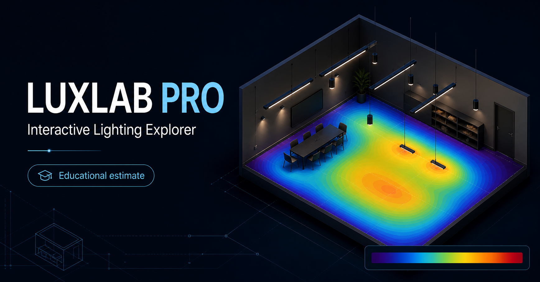
Start with the correct calculation surface
A false-colour image only describes the surface or area selected for evaluation. For an office, that may be a desk workplane; for a warehouse, it may include floor areas, aisles or rack faces; for a road, it is the defined road evaluation field. If the wrong plane or boundary is used, a colourful image can still answer the wrong question.
Before reading any colours, check the calculation object's height, limits, grid and intended task. DIALux separates calculation objects, isolines, false colours and value charts so results can be evaluated on the relevant surface.
Use colour to find the location, then use values to judge it
False colours are excellent for revealing the pattern: bright pools under luminaires, dark edges, weak corners, gaps between high bays or uneven light around a loading bay. They are a visual diagnostic, not a pass or fail result by themselves.
Next, read the value chart and result summary. Average illuminance, minimum illuminance and uniformity should be checked against the project's agreed target for that particular area. A layout can produce an acceptable average yet still have a low point in a location people need to use.
Keep the colour scale honest when comparing options
A comparison only makes sense when the calculation surfaces, luminaire files, maintenance assumptions and colour scale are comparable. Changing the display range can make two layouts look more or less dramatic without changing the actual lux values.
For client review, issue the false-colour view with the plan, key values and stated assumptions. This makes it clear whether the decision is about spacing, optic, mounting height, aiming or the underlying target—not simply which picture looks brighter.
What a useful DIALux result pack should show
For most industrial and outdoor decisions, a useful pack identifies the area being assessed, selected luminaire photometry, layout and mounting information, the relevant result table, and a visual result such as a false-colour view or value chart. The aim is traceability: someone reviewing the report should understand what was calculated and why.
For formal submissions, final acceptance remains with the relevant consultant or authority. A DIALux image supports the calculation record; it does not replace the current project specification, product verification or installation review.
Frequently asked questions
Does red always mean the lighting design is good?
No. False-colour palettes are display tools. A red zone may simply be above the selected display band. Read the legend, the actual values and the project target before judging the design.
Why can the average lux be acceptable but the DIALux picture still look uneven?
An average combines many points. False colours and value charts reveal where the lowest and highest points are, which is why they are useful alongside the average and uniformity result.